
Stone Studios
Andrew Stone is a Minnesota-based lifestyle product photographer and videographer, creating content for health, wellness and fitness brands! As your content partner, his main goal is to provide consistent, creative & strategic content that best represents your brand and speaks to your audience.
2026
Branding
Color Palette
The Project
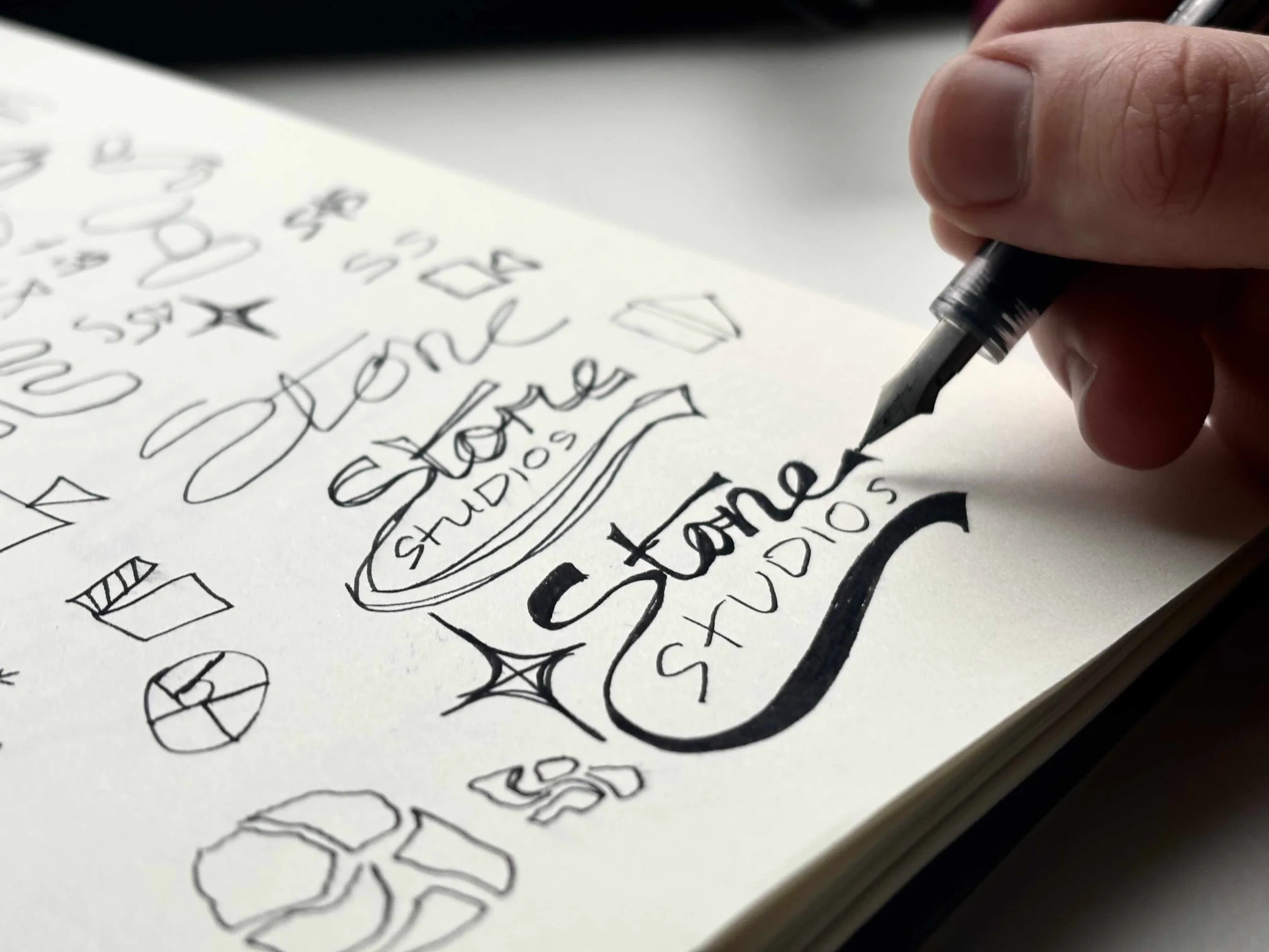
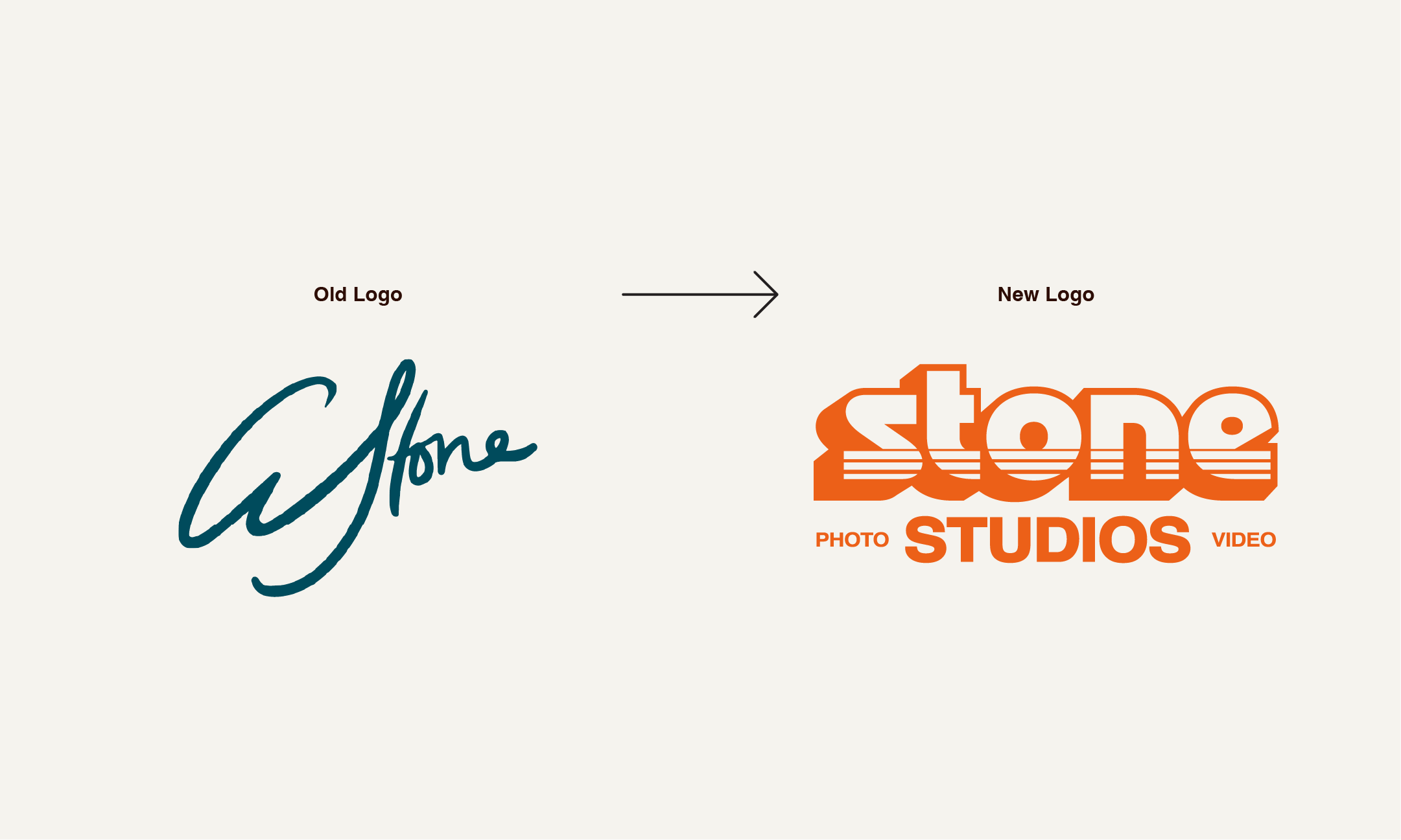
This was a personal freelancing project I did during my senior year of college. The client was a video and photo company who had an old logo and felt like he needed one that better suited his needs and would position him as a more professional business.

The Plan
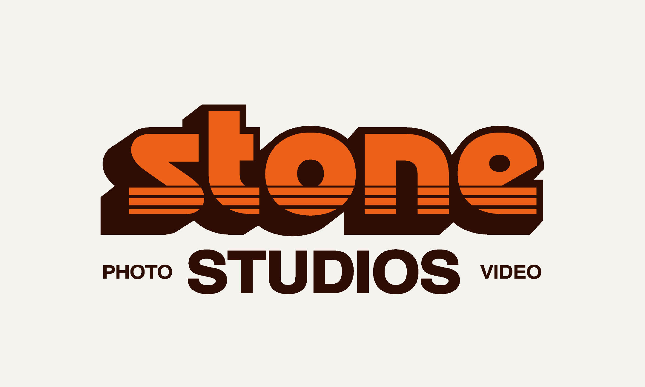
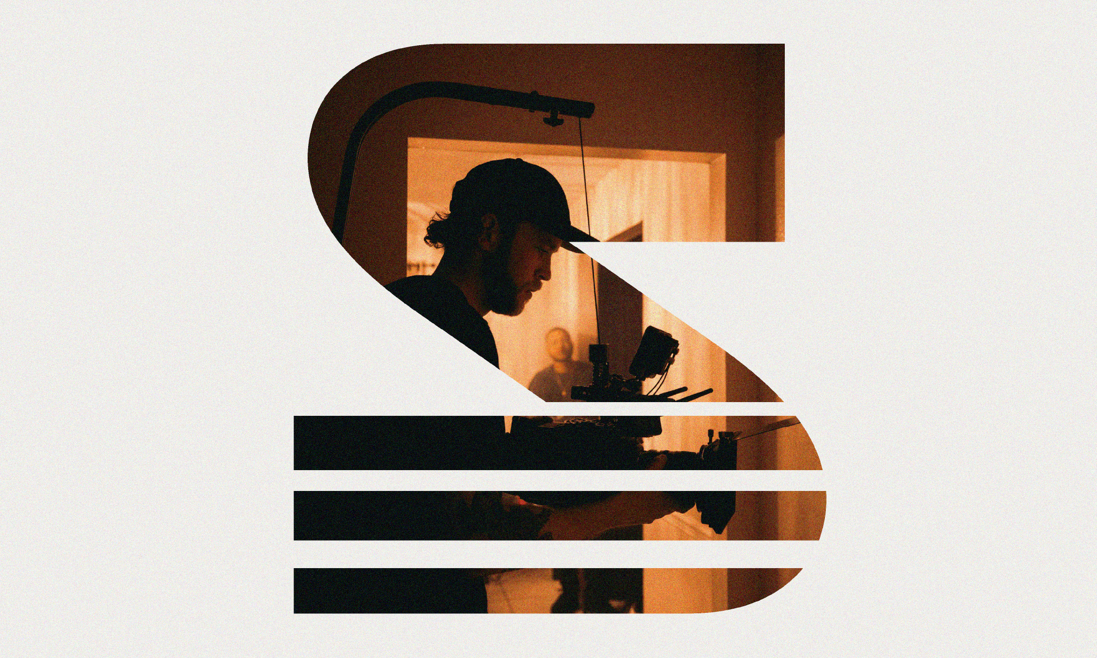
Andrew Stone likes to embrace vintage vibes with his work and often leans into this aesthetic. So he knew he wanted his logo to resemble that. There was a lot of back and forth on what “vintage” actually meant for this logo and how we wanted that to be conveyed. What we ended up deciding was that it would be conveyed through the 3D text effect that can so often be seen in older, vintage logos. The lines that run through both the logo mark and wordmark are also part of what we decided would convey that sense of being from the past, along with the colors.
The Process
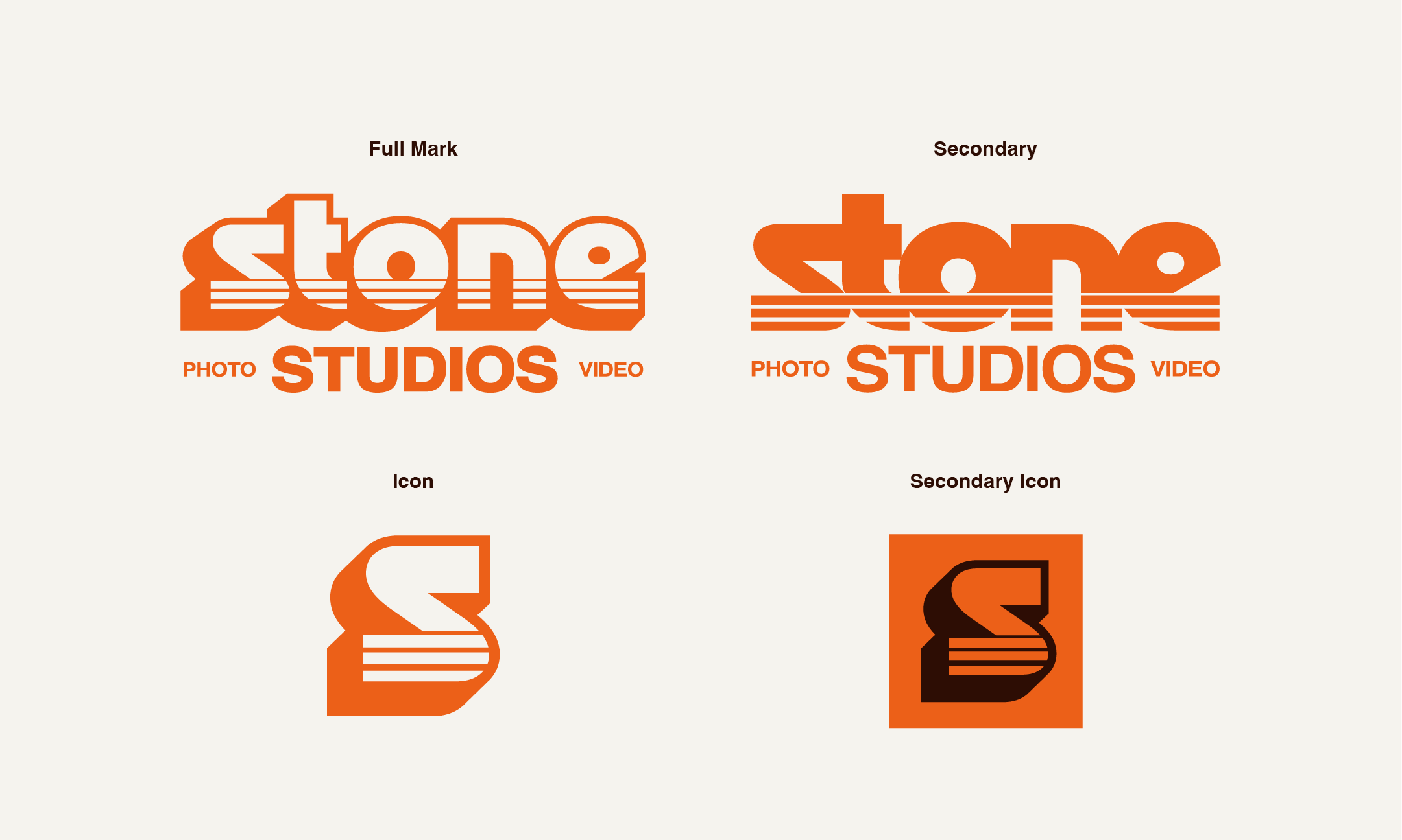
Ultimately we decided to do a wordmark, because it both felt like it added to the vintage feeling of the logo and also felt approachable and friendly, which represented his personality and companies personal aspect well. There are two different variations of the wordmark, one with the 3D effect and one without, so that if it was needed he would have a simpler option. I also made sure to design an icon that was more scaleable and could be used in cases like a social media icon as well as a favicon.